[SYSTEM SPECS]
CLIENT: 6LACK (LVRN / INTERSCOPE)
ROLE: GRAPHIC DESIGN + CREATIVE DIRECTION
OUTPUT: TOUR MERCHANDISE // VISUAL IDENTITY
STATUS: GLOBAL ROLLOUT // SOLD OUT
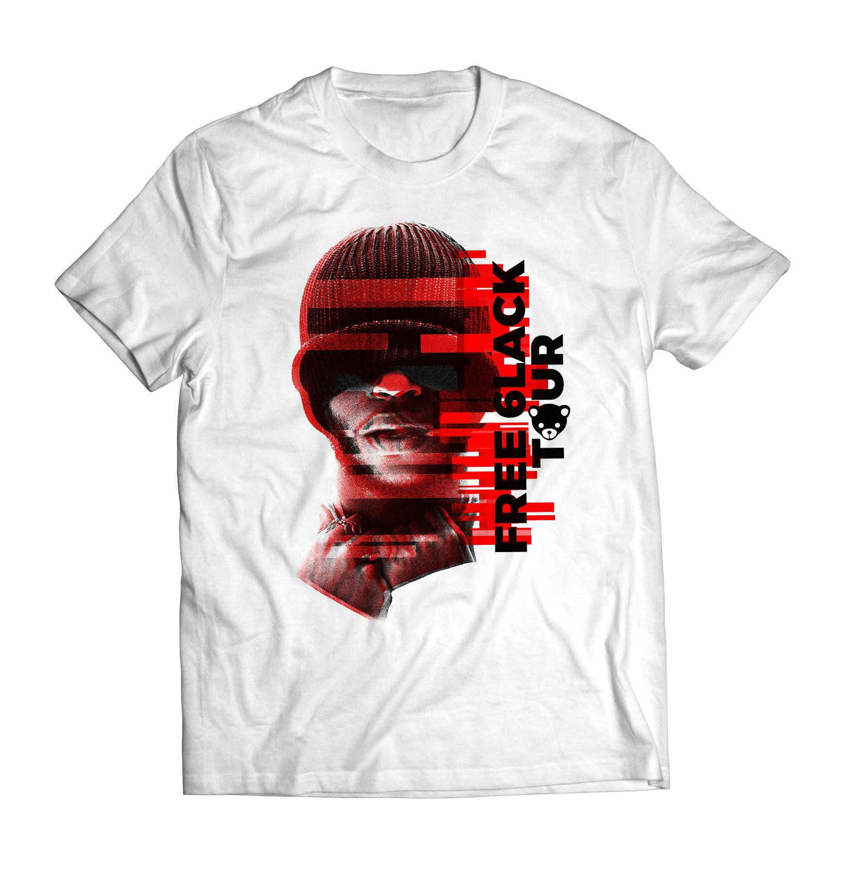
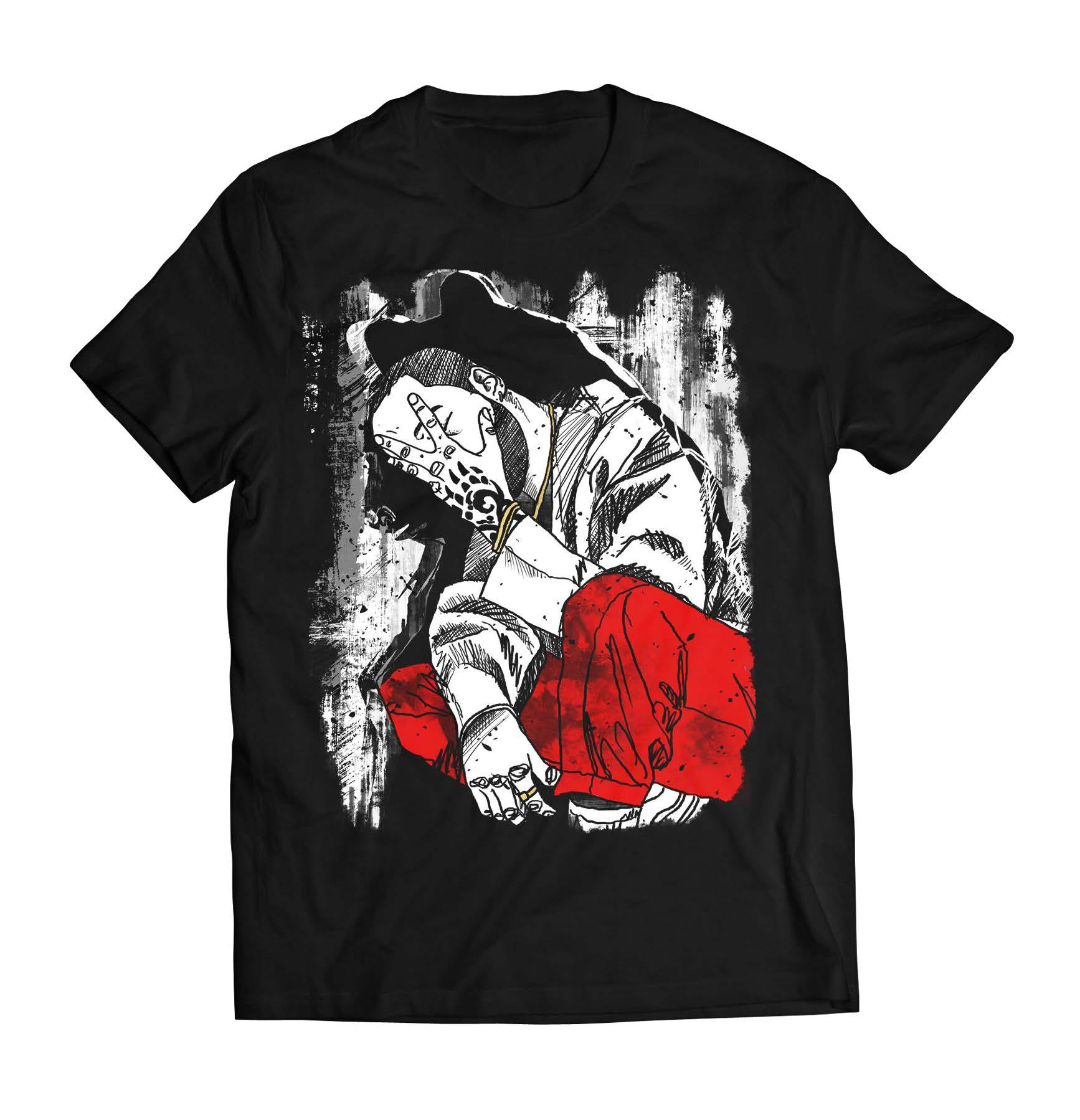
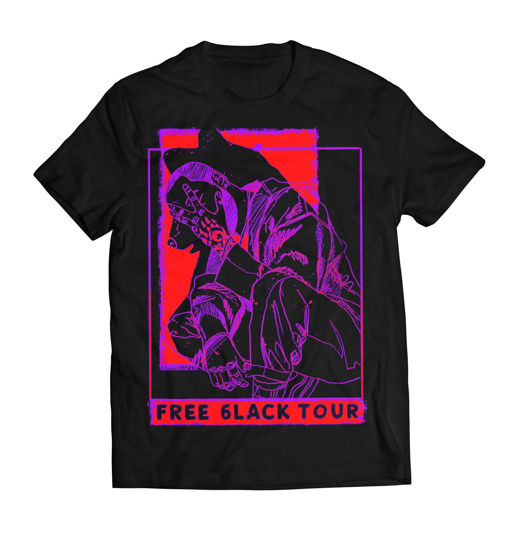
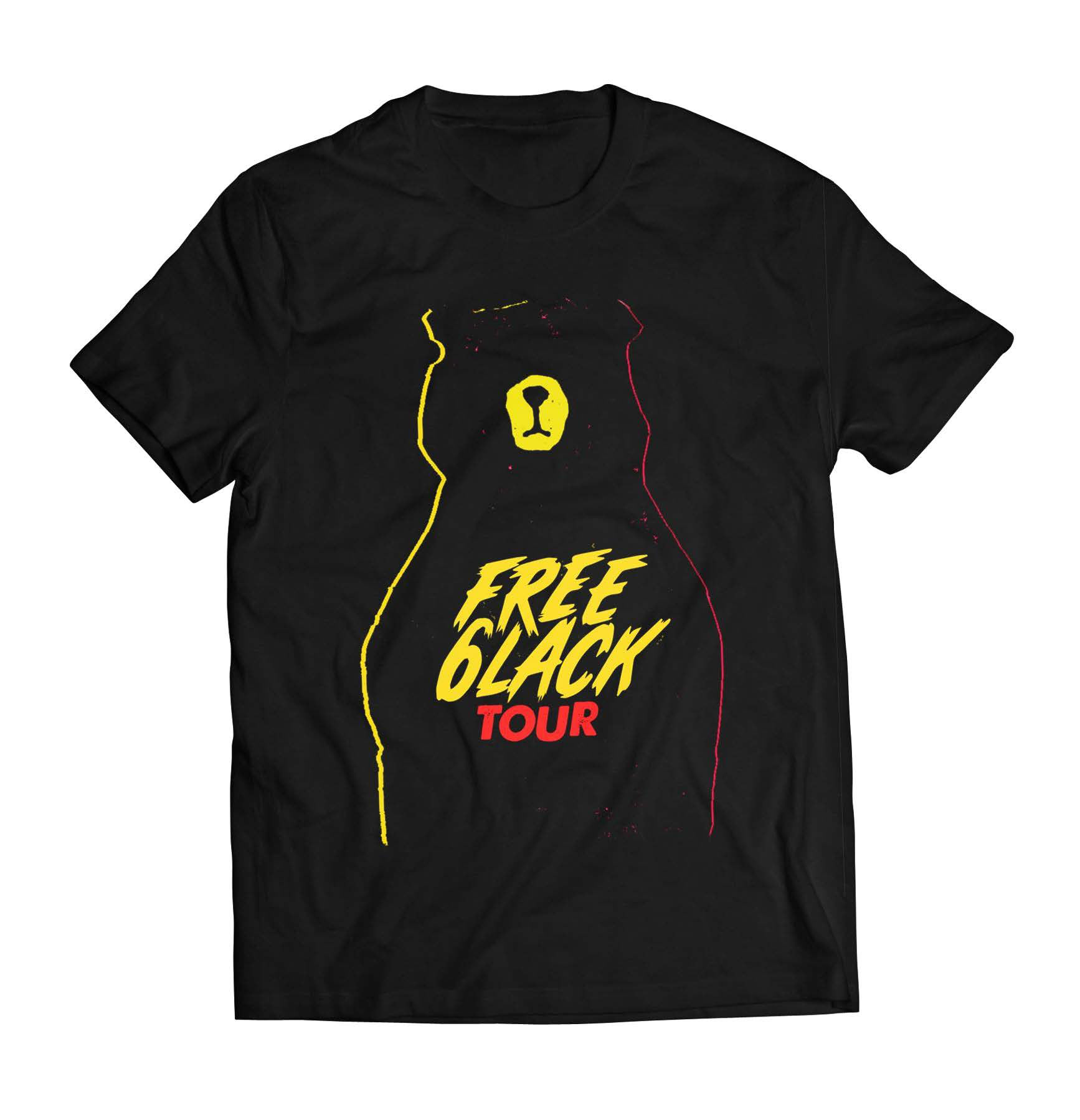
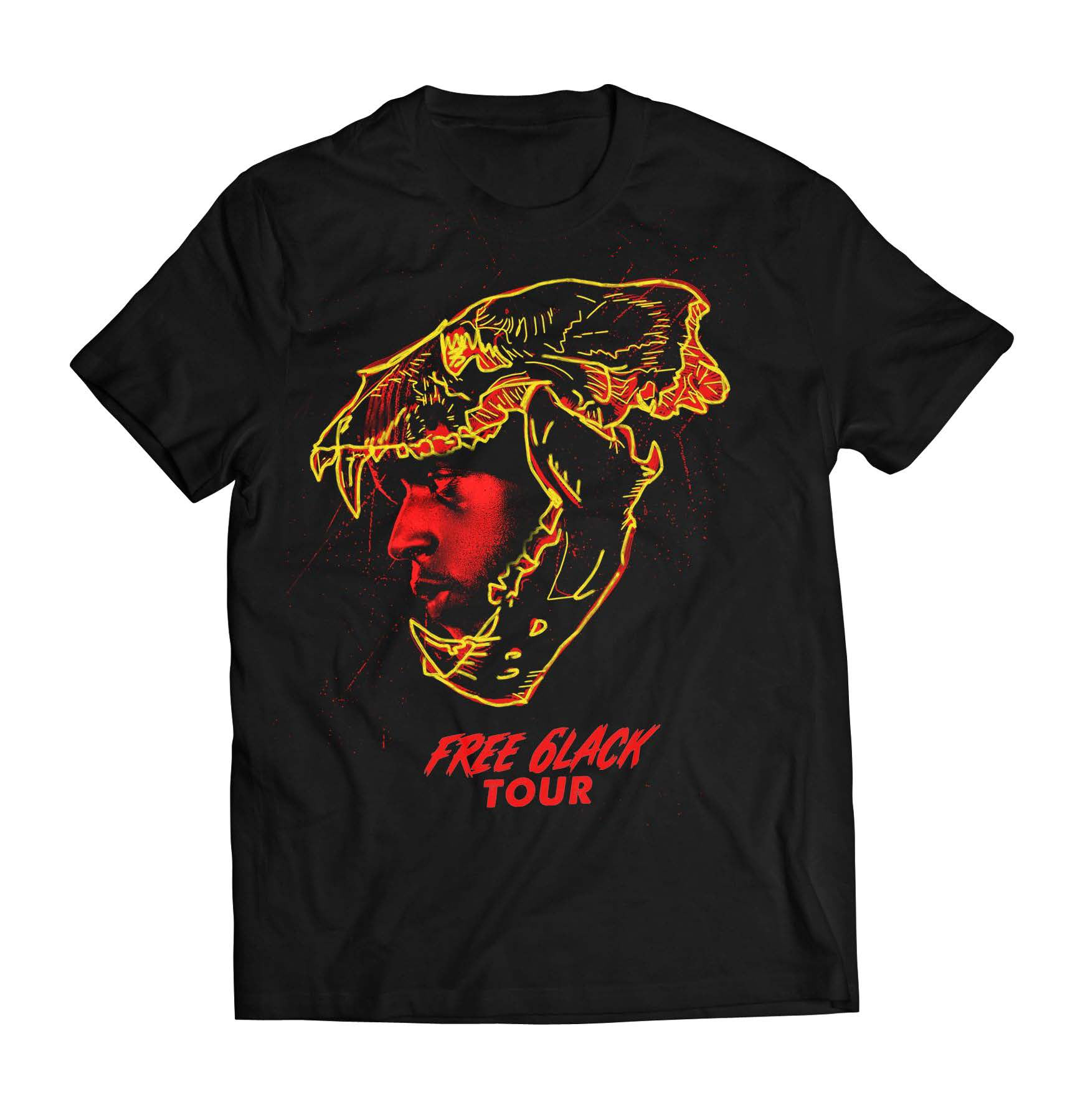
MERCH AS MYTHOLOGY. engineering a wearable visual system for the "free 6lack" era.
[THE.BRIEF] translate audio minimalism into physical product. the goal: build a narrative-driven visual system for the "free 6lack" tour that could scale across apparel, stage visuals, and social. the product needed to balance underground identity with commercial appeal.
[THE.INSIGHT] restraint as a loud signal. 6lack’s brand was grayscale and grounded. we needed to inject energy without breaking the mood. the solution: duality. freedom vs. control. fame vs. anonymity. the merch needed to function as "emotional architecture" for the fanbase.
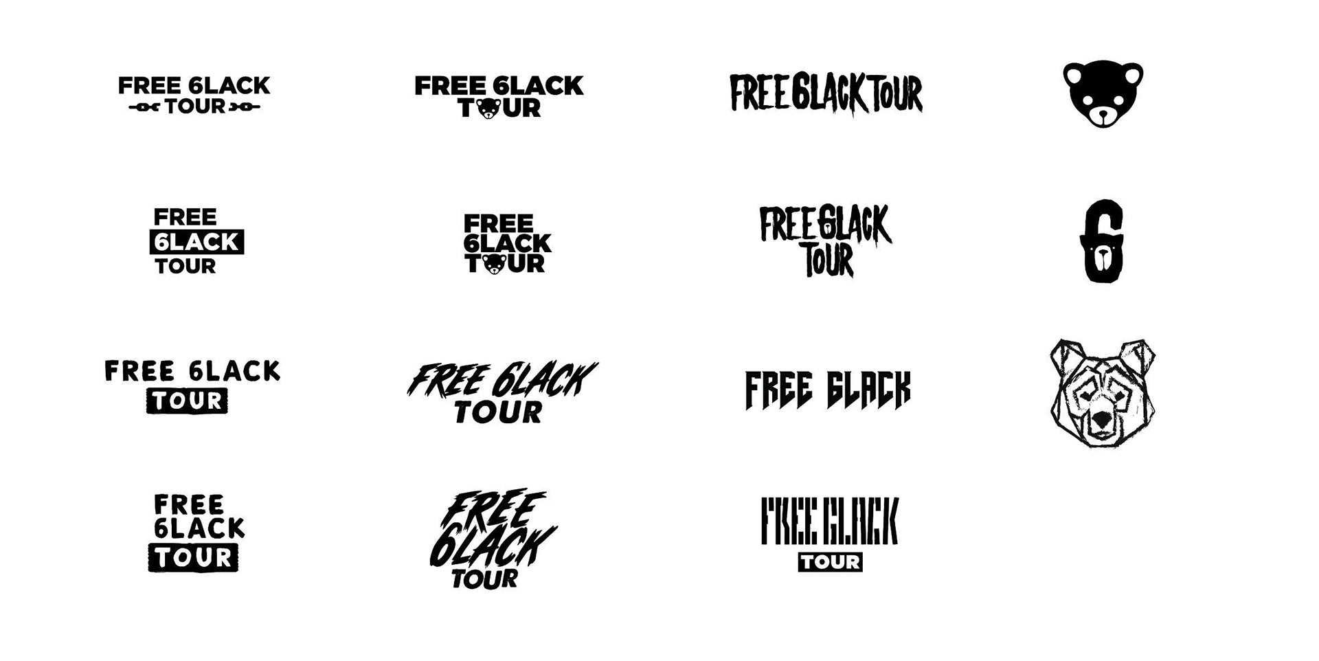
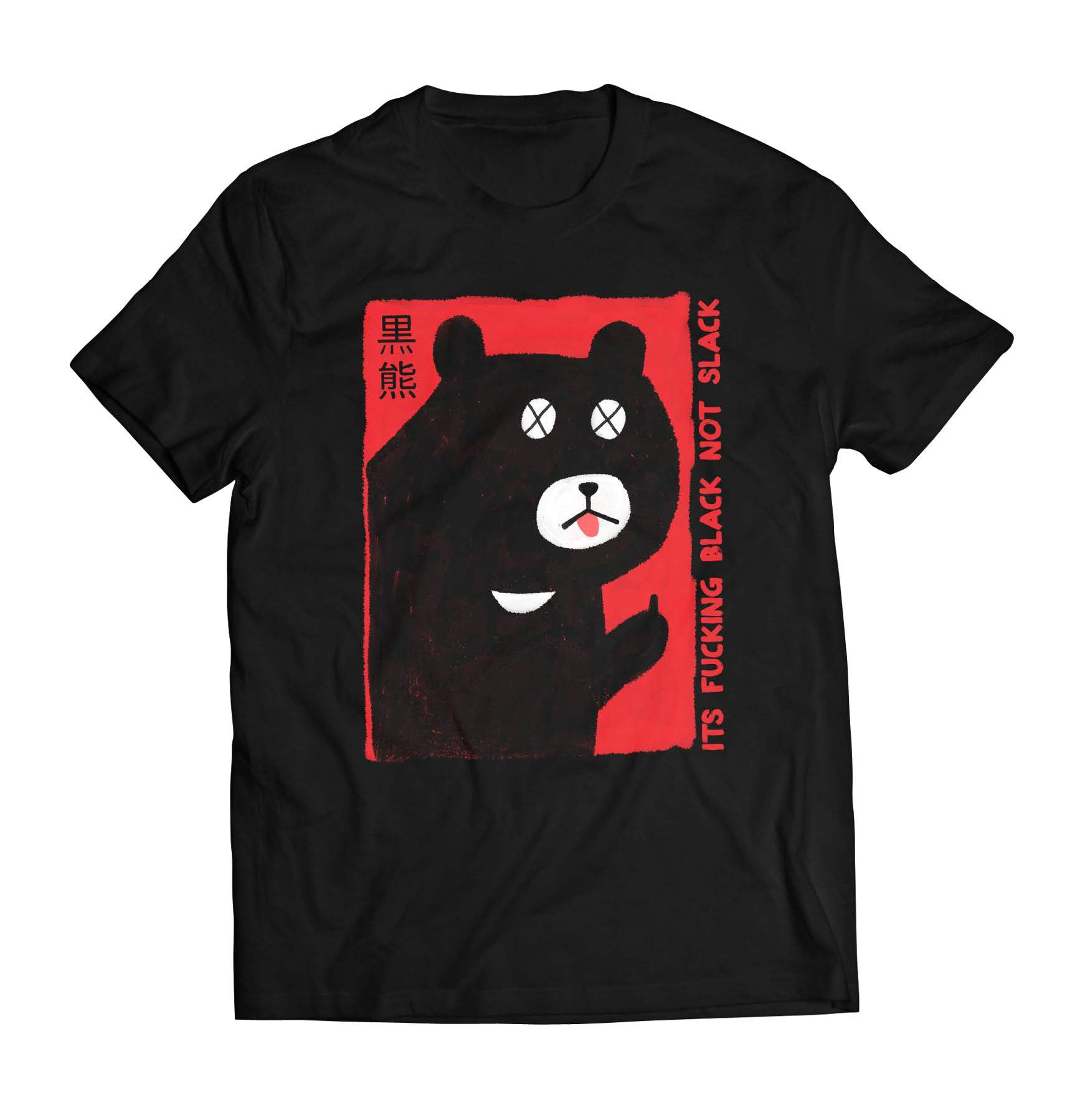
[THE.SYSTEM] contrast // distortion // irony. we leaned into sharp typography and 90s rock-tour composition grids. the motif: the bear icon—a soft, melancholic mascot balancing aggression with irony. palette: black (void), red (emotion), yellow (warning).
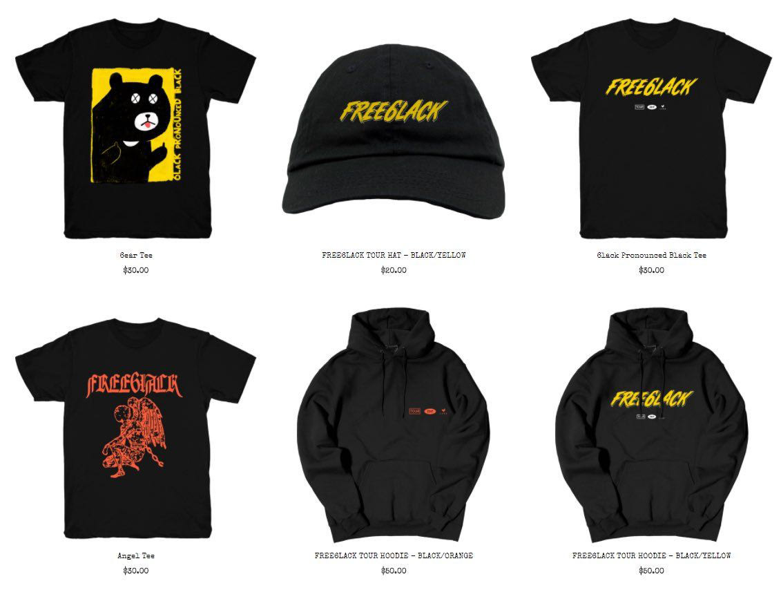
[EXECUTION.LOG] + design: custom typography, hand-rendered illustration, and anime-inspired character art. + format: unisex, oversized street silhouettes designed for the crowd, not just the hanger. + production: managed print-ready files for global retail and online drops via LVRN and Interscope Records.
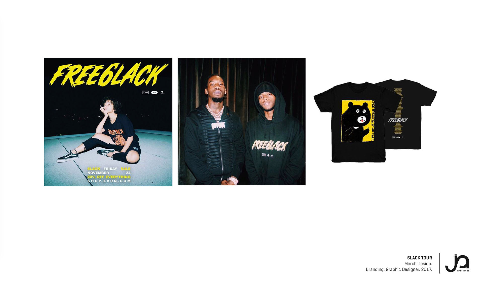
[COMMUNITY.SIGNAL] cultural saturation. the capsule became synonymous with early 6lack iconography. > best-selling capsule on shop.lvrn.com and tour venues. > worn by Offset and key industry figures during the rollout. > solidified 6lack’s transition from R&B artist to visual subculture.
[CLOSING.CODE] designed for freedom. printed for memory. wearable audio history.