


[SYSTEM SPECS]
CLIENT: KODAK
ROLE: CREATIVE DIRECTOR + PHOTOGRAPHER
OUTPUT: VISUAL IDENTITY SYSTEM
STATUS: BRAND ARCHITECTURE // COMMISSIONED
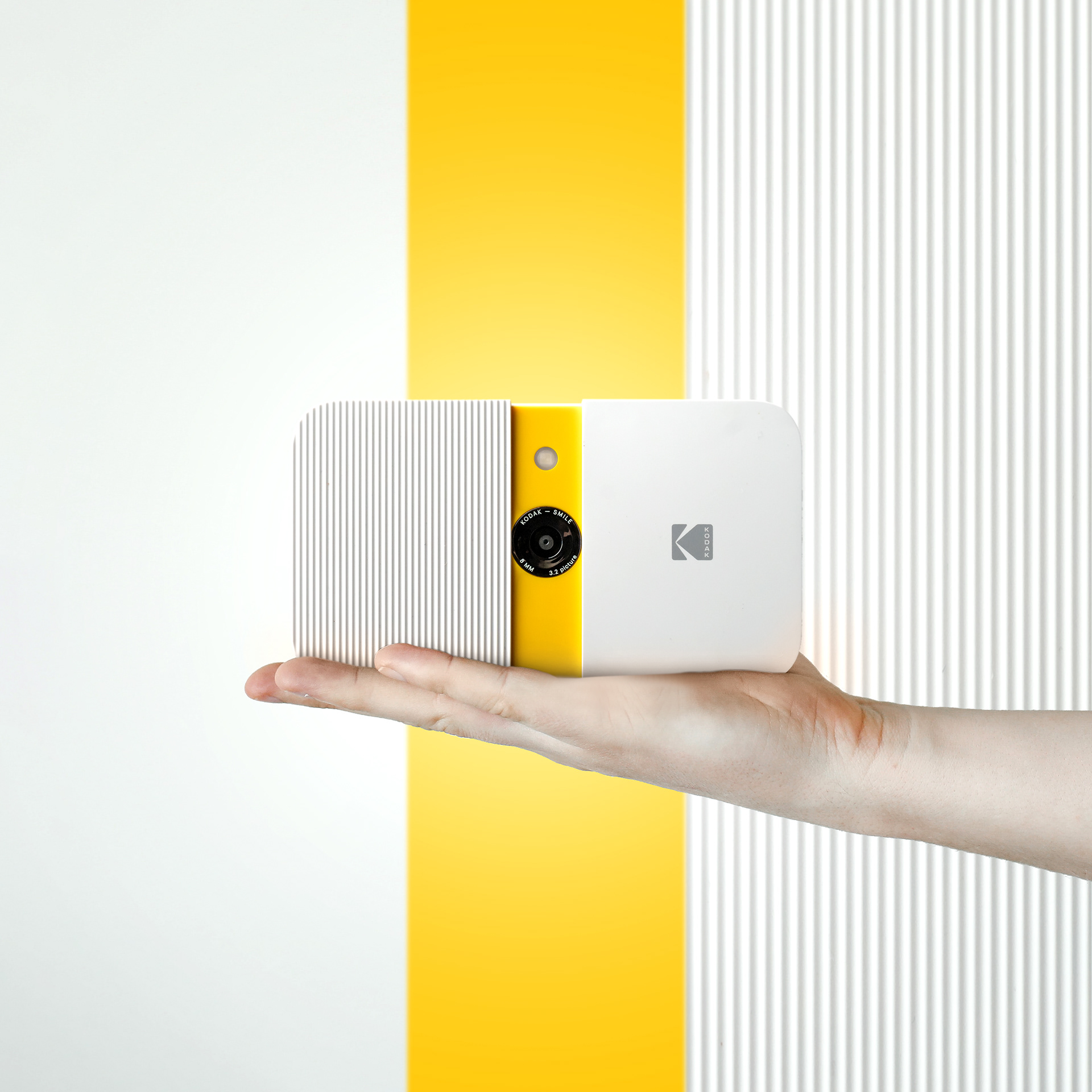
SEEING IN COLOR. re-engineering the collision of heritage yellow and digital instant.
[THE.BRIEF] modernize a legacy. kodak needed to evolve from "film relic" to "lifestyle tech." the objective: craft a visual system for the zink instant print line that honored the brand's history without getting trapped in it. bridge the gap between analog soul and modern form.
[THE.INSIGHT] memory is chromatic. color triggers recognition faster than language. we treated the iconic kodak yellow not just as branding, but as an energy source. the strategy was to celebrate the heritage without drowning in nostalgia—using color as a code for "now."
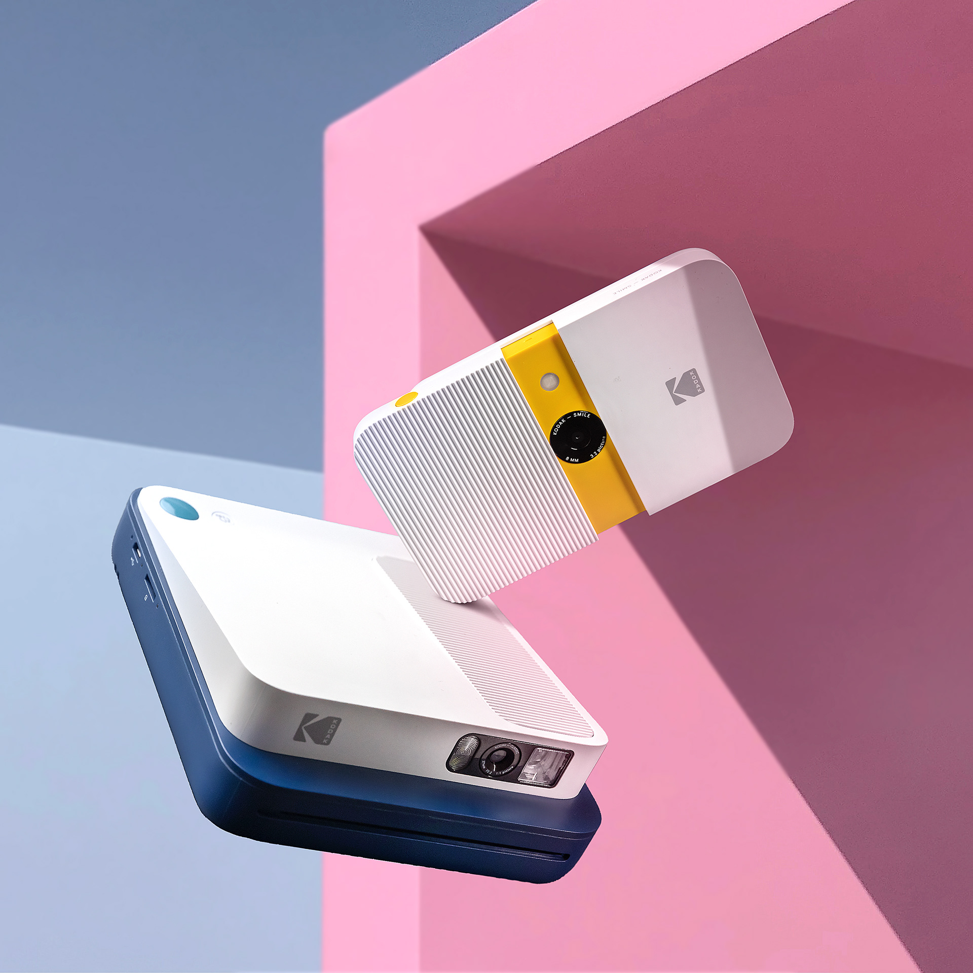
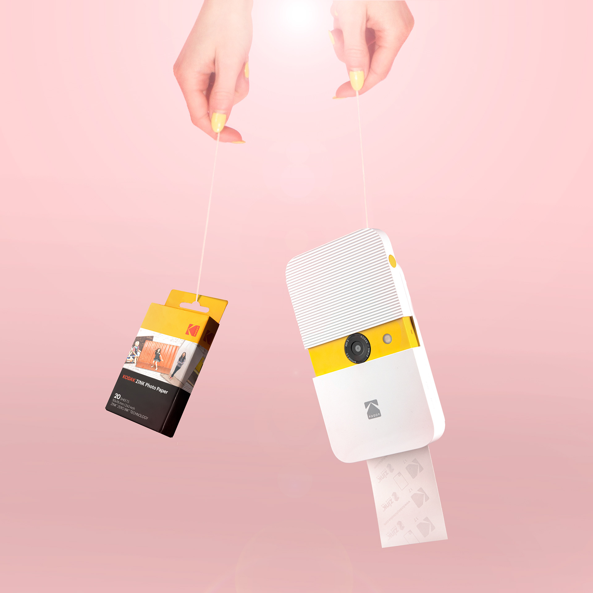
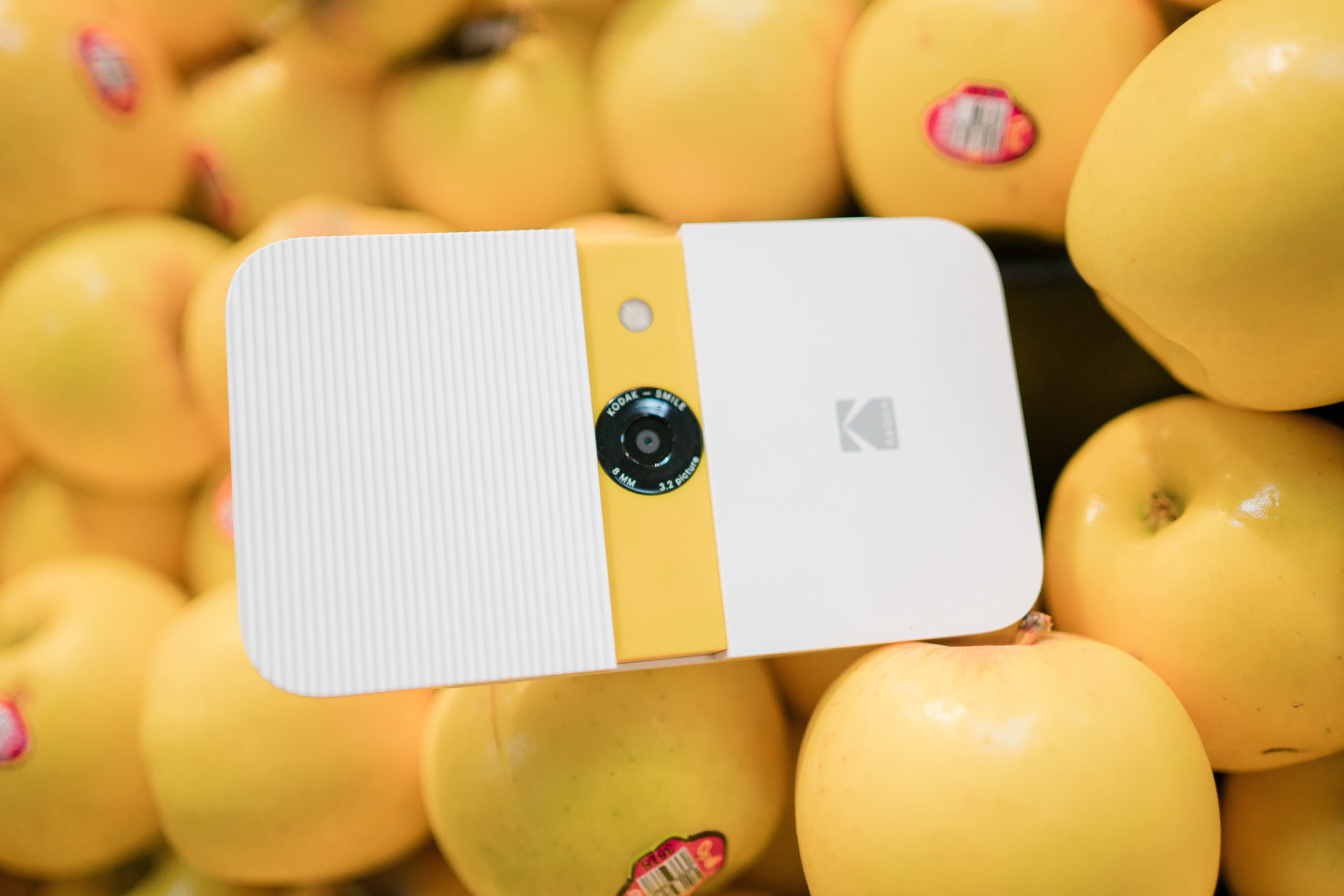
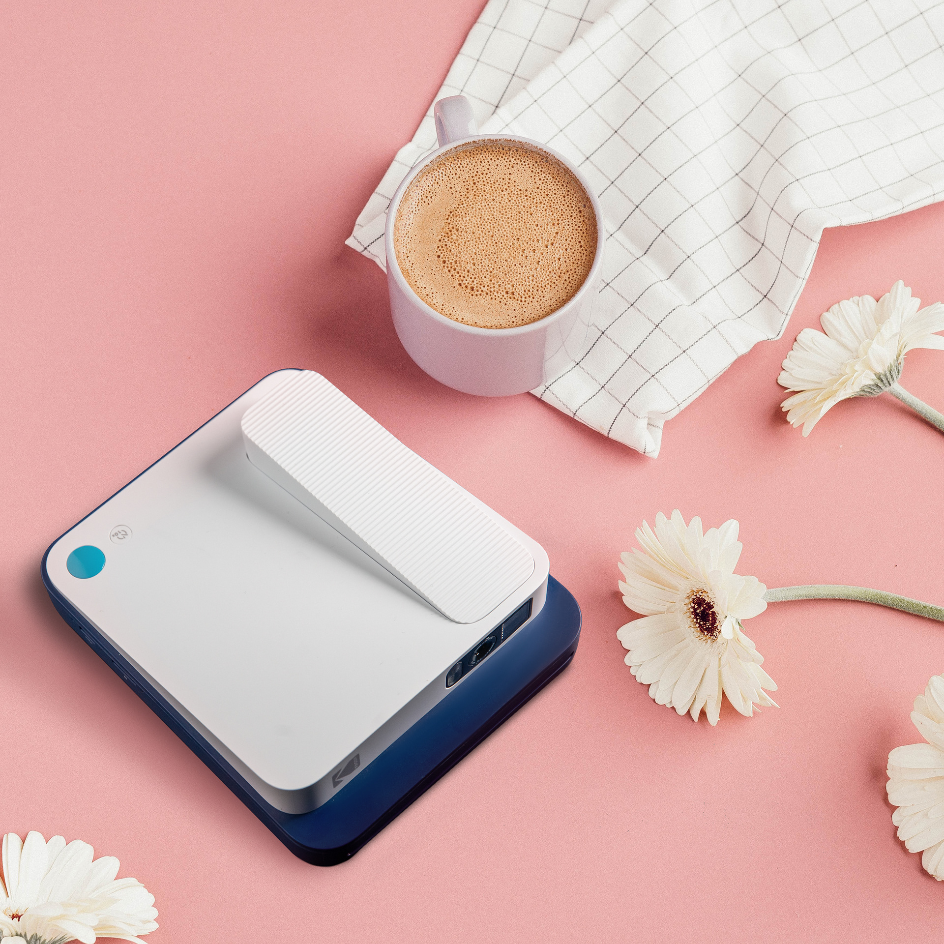
[THE.SYSTEM] geometry // saturation // tactility. a modular visual language exploring how light and structure reframe instant photography. palette: yellow (energy), white (space), pink (play). a cmy-based system designed to vibrate against clean, industrial lines.
[EXECUTION.LOG] + direction: defined the "modern retro" aesthetic, repositioning the camera as a design object rather than just a tool. + set design: utilized color-blocked architecture and minimal geometry to create a graphic, scalable world. + lighting: integrated softbox precision with hard daylight to mimic the "flash" of instant capture.
[STRATEGIC.SIGNAL] defining the visual baseline. the work functioned as a visual blueprint for kodak’s digital revival. > established the art direction standards for the zink product line. > shifted brand perception from "retro artifact" to "modern essential." > created a scalable asset library designed for e-commerce and digital integration.
[CLOSING.CODE] see color. feel memory. nostalgia, re-engineered.