

[SYSTEM SPECS]
CLIENT: THE NORTH FACE x CORDURA
ROLE: CREATIVE DIRECTOR + PHOTOGRAPHER
OUTPUT: EDITORIAL CAMPAIGN
STATUS: COMMISSIONED // DEPLOYED
BUILT FOR THE ELEMENTS
engineering the collision of alpine durability and street precision.
[THE.BRIEF] translate technical performance into cultural signal. the north face x cordura collaboration isn't just outerwear; it is armor. the objective: visualize impermeability without saying a word. bridge the gap between mountain utility and city grid.
[THE.INSIGHT] utility is the new luxury. modern explorers oscillate between high-altitude ridges and urban concrete. they demand gear that functions as a survival tool and a style code. the visual language needed to feel cold, clinical, and expensive.
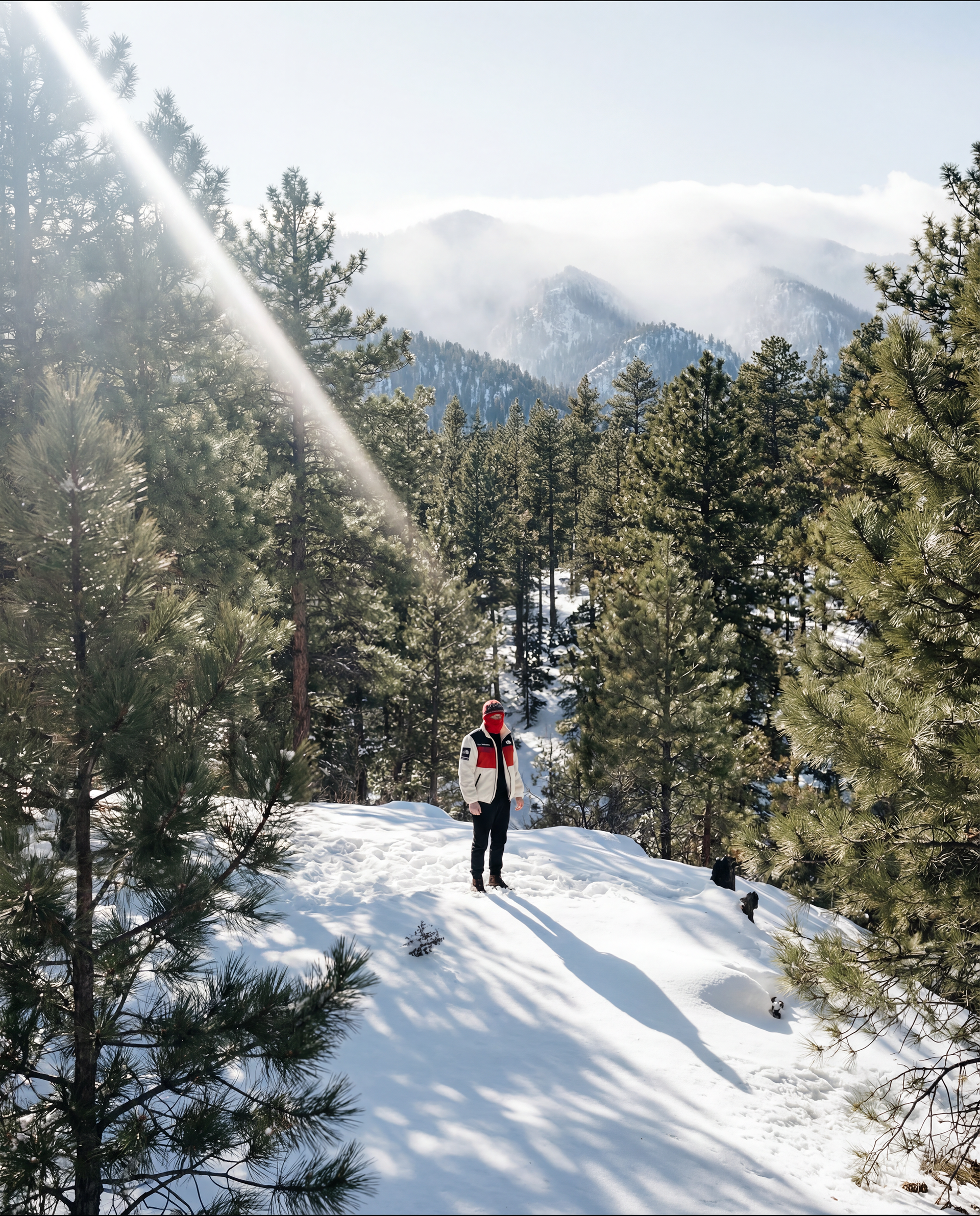
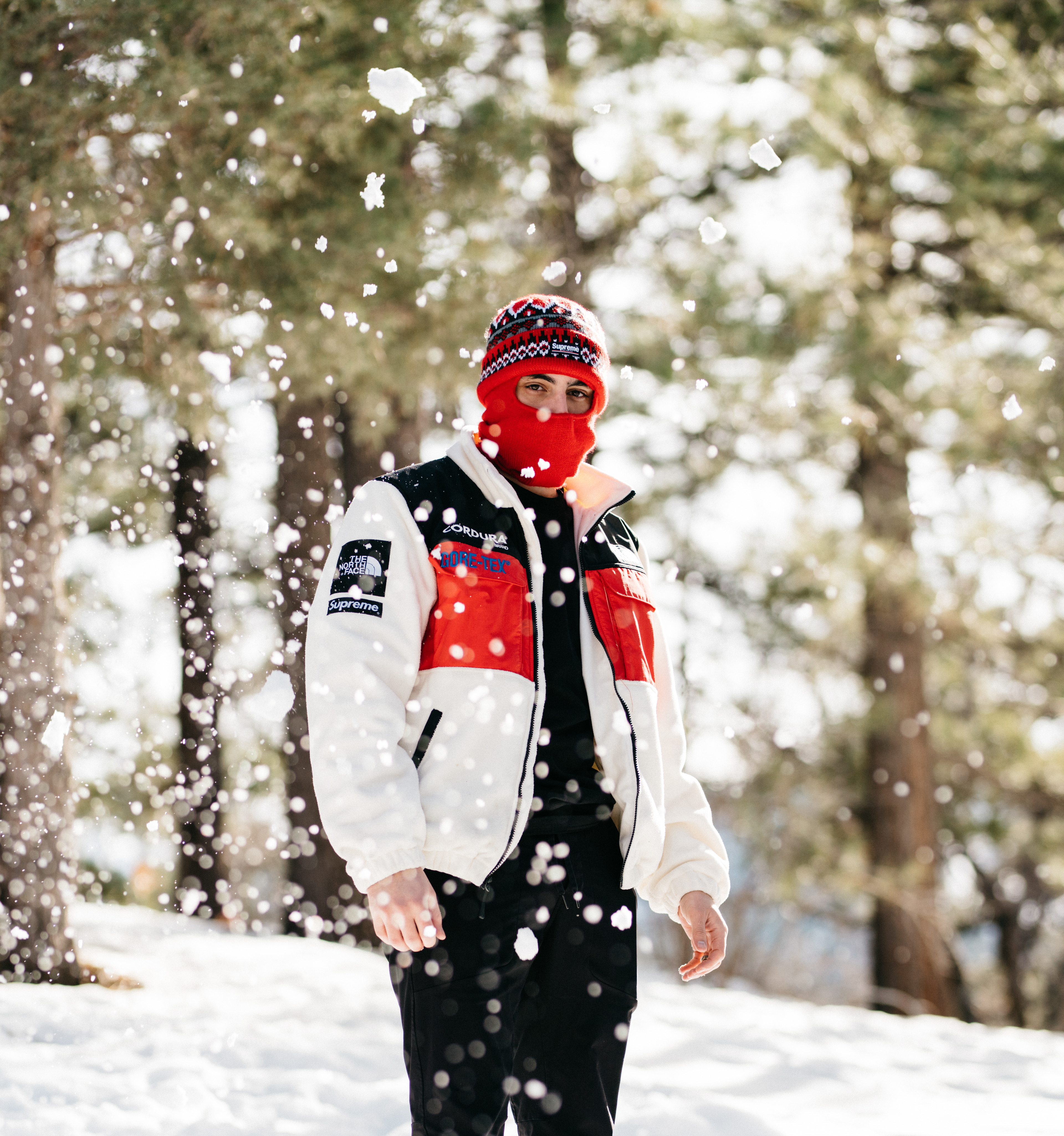
[THE.SYSTEM] isolation // geometry // repetition. we stripped away the lifestyle fluff. no smiles. no coffee shops. just the human form against the elements. palette: red (signal), white (noise), black (void). an engineered spectrum of survival.
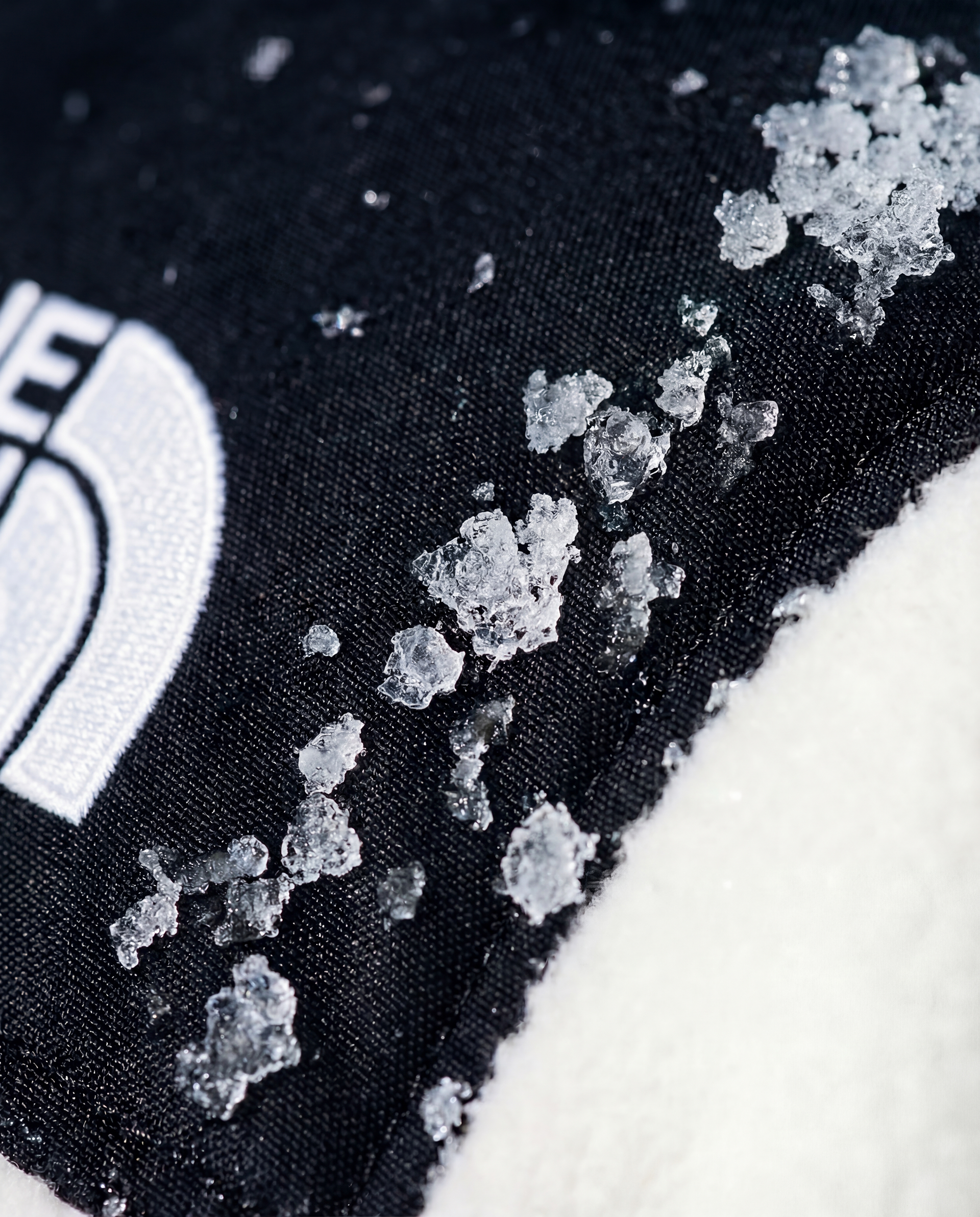
[EXECUTION.LOG] + location: san Bernardino mountains (high elevation).+ lighting: ambient only. used natural snow albedo as a massive softbox to retain texture detail. + grading: lifted whites, crushed blacks, protected red channel integrity. + focus: tactile fabric rendering. making the cordura weave visible to the naked eye.
[COMMUNITY.SIGNAL] zero ad spend // organic velocity. the campaign bypassed traditional media buy, relying on visual weight alone. > the north face audience reposted immediately upon capture. > cordura utilized hero frames to showcase material innovation. > established a visual benchmark for "technical luxury."
[CLOSING.CODE] built for the cold. designed for movement. function meets faith in form.